

Case Study: Rebranding a sports eyewear ecommerce brand | Sporteyes.com
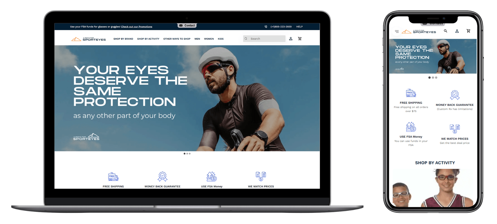
To modernize the brand identity of A Sight for Sport Eyes without losing the trust and heritage built over two decades. The project required a full visual refresh—including logo, color palette, typography, and tone of voice—alongside the creation of comprehensive brand guidelines to ensure consistency across digital, print, and product touchpoints. The new identity needed to resonate with a modern audience while staying true to the brand’s legacy and values.
- Strategy
- Brand Strategy
- Design
- Identity Design
- Client
- SportEyes
- Niche
- Sports Eyewear
About the Client
For over two decades, A Sight for Sport Eyes has been a trusted name in specialized sports eyewear, dedicated to protecting athletes’ vision and educating consumers about eye safety. To maintain their competitive edge and resonate with modern consumers, the brand recognized the need for a comprehensive rebranding initiative.
The Challenge
In an industry where aesthetics and brand perception are paramount, A Sight for Sport Eyes faced several challenges:
- Outdated Brand Identity: The existing branding no longer reflected the company’s evolution or appealed to contemporary audiences.
- Market Competitiveness: Emerging competitors with modern branding threatened to overshadow the established presence of A Sight for Sport Eyes.
- Consistency Across Platforms: The absence of cohesive brand guidelines led to inconsistent representations across various channels.
Objectives
The rebranding initiative aimed to:
- Modernize the Visual Identity: Develop a fresh logo, color palette, and typography that align with current design trends while honoring the brand’s legacy.
- Establish Comprehensive Brand Guidelines: Create a dynamic manual to ensure consistent brand representation across all mediums.
- Enhance Market Positioning: Reinforce the brand’s commitment to quality and innovation in the sports eyewear sector.
Our Approach
Our strategy was meticulously crafted to address the brand’s unique challenges and objectives:
1. In-Depth Brand Discovery
We initiated the process by immersing ourselves in the brand’s ethos:
- Stakeholder Engagement: Conducted comprehensive questionnaires and discovery sessions with key team members to understand the brand’s history, values, and aspirations.
- Market Analysis: Evaluated the competitive landscape to identify opportunities for differentiation and areas requiring alignment with industry standards.


2. Research and Concept Development
Building on our discoveries:
- Visual Direction Exploration: Curated mood boards and visual concepts reflecting various design directions, ensuring alignment with the brand’s vision and market expectations.
- Collaborative Feedback: Presented initial concepts to stakeholders, facilitating discussions that led to the selection of an orange-blue color scheme, symbolizing energy and trust.

3. Logo Redesign
With a clear visual direction:
- Conceptualization: Developed multiple logo iterations that encapsulated the brand’s essence and appealed to the target demographic.
- Refinement: Through iterative feedback, honed the designs to a final logo that seamlessly blends tradition with modernity.


4. Establishing Brand Guidelines
To ensure consistency:
- Comprehensive Manual Creation: Documented detailed guidelines covering logo usage, color palettes, typography, imagery, and tone of voice.
- Versatility Focus: Ensured the guidelines facilitate cohesive brand representation across digital platforms, print materials, and product packaging.

Outcome
The rebranding initiative culminated in a revitalized brand identity that:
- Resonates with Modern Consumers: The updated visuals and cohesive branding appeal to contemporary aesthetics and consumer expectations.
- Strengthens Market Position: Reinforces A Sight for Sport Eyes’ commitment to innovation and quality, distinguishing it from competitors.
- Ensures Consistency: The established brand guidelines provide a unified framework for all brand communications and representations.


Conclusion
Through a strategic and collaborative approach, A Sight for Sport Eyes successfully transformed its brand identity, balancing its rich legacy with modern appeal. This rebranding not only enhances visual aesthetics but also fortifies the brand’s position in the competitive sports eyewear market.

