How a Research-Driven Shopify Revamp Helped Artisan Roast Brew 15% More Sales
– 15.51% increase in mobile conversions
– 13.60% overall conversion lift
– 8.2% increment in first-time purchasers
Task
To plan and deliver a research-driven redesign of Artisan Roast’s Shopify store, guided by insights from a thorough audit and competitor benchmarking. The goal was to select the right theme, design practical mockups, and build a user-friendly, mobile-first store that converts more visitors into loyal buyers and subscribers.
-
Strategy
UX, Usability, Shopify Development
-
Design
UI/UX Design
-
Client
Artisan Roast
-
Niche
Specialty Coffee
Meet Artisan Roast — Specialty Coffee Roaster from Scotland
When Artisan Roast opened its first roastery café in Edinburgh back in 2007, it changed the city’s coffee culture forever. Fast-forward to today: it’s a beloved name in Scotland’s third-wave coffee scene, with four café locations, known for exceptional micro-lots, signature blends like Janszoon, and a loyal base of regulars.
However, there was one area that didn’t match their reputation for quality: their online store.
The Challenge
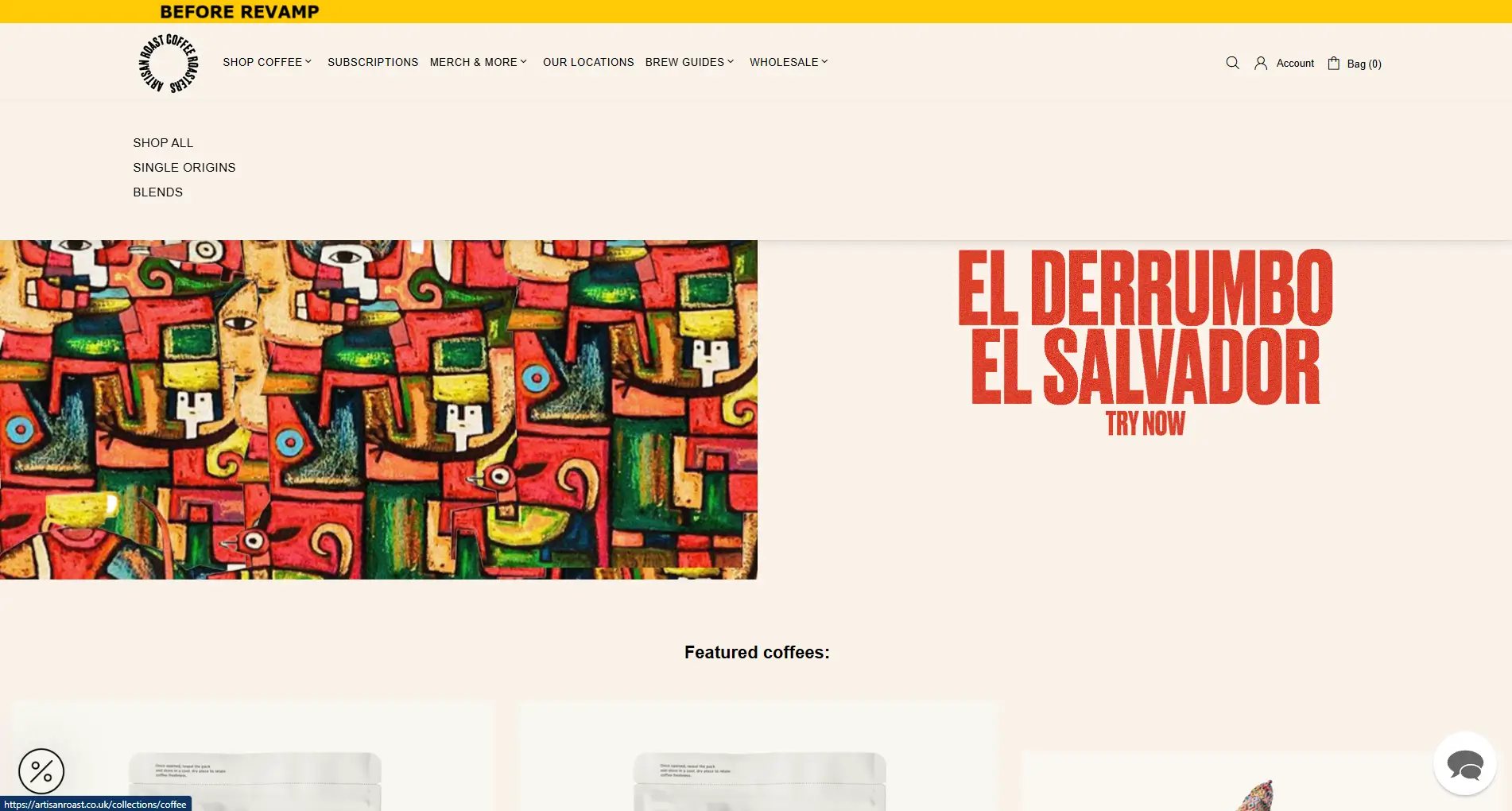
Like many independent roasters, Artisan Roast’s Shopify store had evolved in bits and pieces over the years. A quick theme tweak here, a new page added there — often done reactively to solve an immediate need.
This patchwork approach led to familiar problems: an inconsistent look and feel, confusing menus, redundant pages, plug-ins that didn’t play nicely together.
It worked, but:
- The website was difficult to use and navigate on mobile, with some sections even appearing distorted.
- The menu wasn’t clearly categorised, making it harder for customers to find the right product quickly.
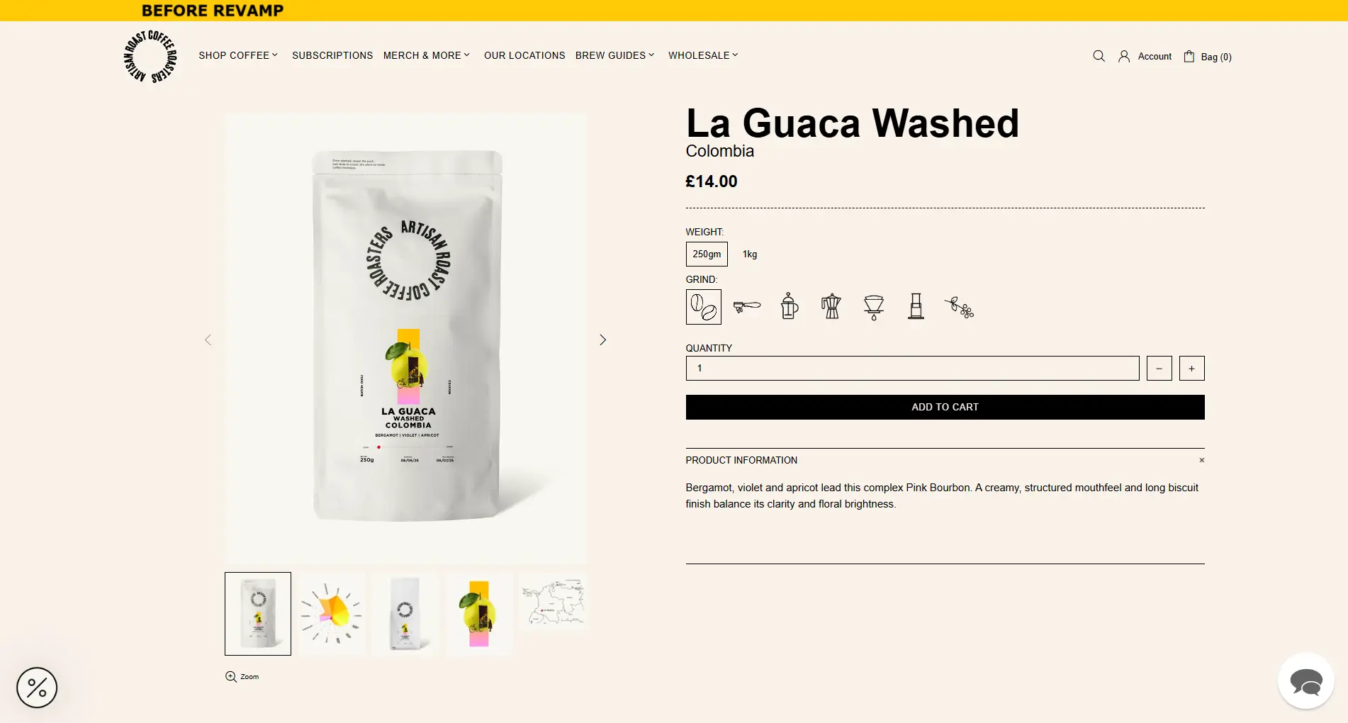
- Product pages were too text-heavy, taking away the enjoyment of browsing.
- There were technical and on-page SEO issues affecting visibility and performance.
- The overall user interface felt dated and didn’t match the premium, handcrafted experience Artisan Roast is known for.
Artisan Roast knew their digital storefront needed the same care they put into roasting beans. So, they asked us: How can we fix it — and make sure it keeps working for years to come?
Our Approach: Research First, Then Plan, Then Design
Rather than jumping straight into redesigning pages, we began with a deep-dive discovery and planning phase — so every decision would be driven by real insights and practical needs.
What We Uncovered
👉 From Competitor Benchmarking:
We reviewed 108 coffee roasters’ websites to understand how the best in the industry design their online stores — insights we’ve detailed in this article on top coffee roaster website design.
A few patterns stood out:
- The best roasters use storytelling, tasting notes, and origin maps to build trust and create an emotional connection with customers.
- They design mobile-first, ensuring a smooth, intuitive experience for shoppers on any device.
- Their product pages strike the perfect balance: clean layouts enriched with clear information and engaging visuals.
- Their site structure is logically organised and easy to navigate, guiding even first-time visitors to the right coffee without confusion.
👉 From Analytics & Heatmaps:
- 58% of traffic was mobile, but conversions were significantly lower than desktop users.
- Only a few sections on the homepage showed strong engagement, while other important content was often skipped.
- Category pages saw a high number of clicks on side filters, indicating shoppers struggled to narrow down choices.
👉 From Website’s UX and Usability Audit:
- Mobile layouts had display issues, like overlapping text and buttons too small to tap easily.
- Product pages were overly text-heavy, with few visuals, tasting notes, or brewing tips to guide shoppers.
- Menus required too many taps and swipes to reach popular products, adding friction on mobile.
- Inconsistent styling and buried trust signals made the site feel less polished and hurt credibility.
From Insights to a Practical Blueprint
1️⃣ Page-by-Page Planning:
To translate our research into clear actions, we mapped out every section and element needed for each type of page — from the homepage to categories, sub-categories, and all product variations (single origin, blends, pre-orders, merchandise, equipment). This planning doc in Google Sheets became our single source of truth, ensuring nothing was missed and every page served its purpose.
2️⃣ Structured Product Data:
Previously, coffee specs were buried in large, inconsistent text blocks on each product page. This caused two big issues:
- Information structure varied from product to product.
- Filtering by key specs (like Roast Level, Origin) wasn’t possible.
To fix this, we created clear, product-scoped Metafields for important specs — making data consistent, filterable, and reusable across the store.
3️⃣ Theme Selection and Mockups:
With our page plans and structured data ready, we carefully selected a Shopify theme that matched our required layouts and offered developer-friendly flexibility in the theme editor.
Next, we developed mid-fidelity mockups in Figma, turning our plans into tangible wireframes for every key page and flow — setting up a build process that was efficient, on-brand, and user-focused.

The Revamp
Armed with data, industry and competitor research, we got to work fine-tuning every detail of Artisan Roast’s Shopify store.
Here’s what we improved — and why it made a difference:
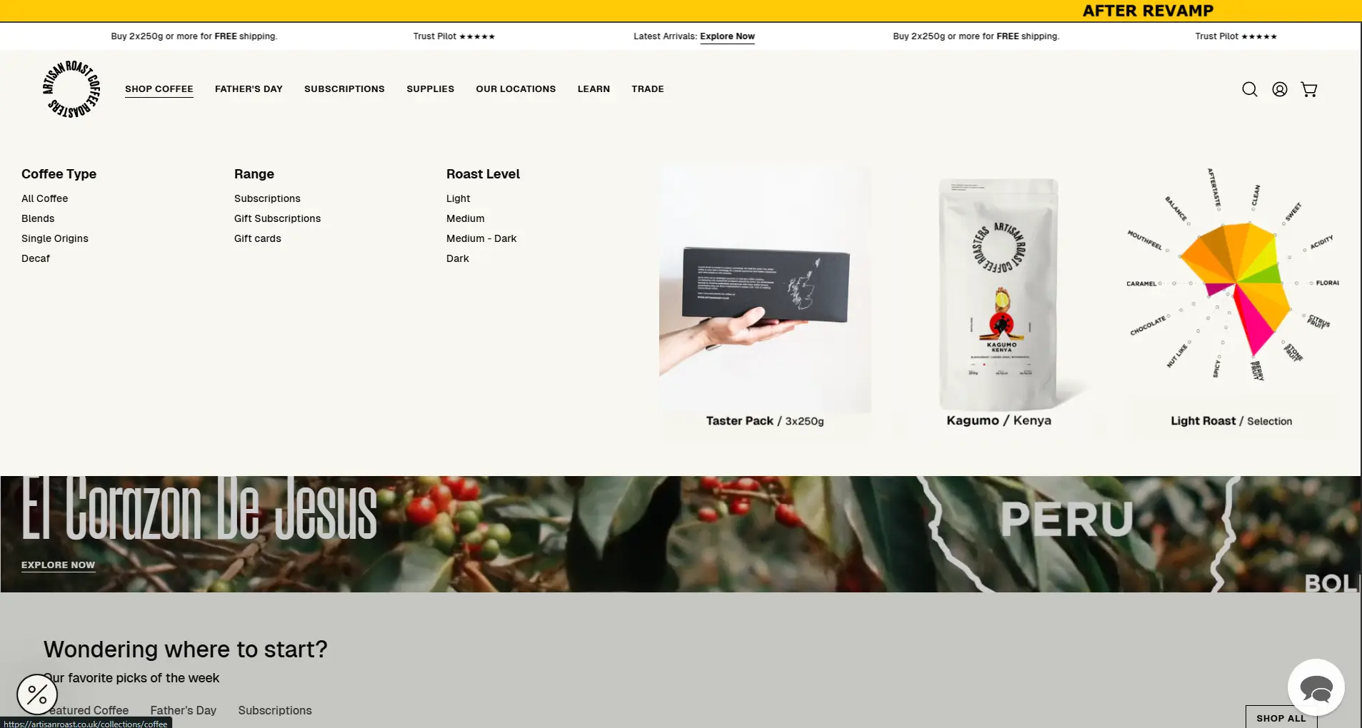
1. Clear, Intuitive Navigation
We redesigned the entire menu structure so visitors could find what they love in seconds: Blends, Single Origin, By Roast Level, Subscriptions, Supplies — simple, logical, and easy to browse.
2. Consistent, Café-Warm Typography & Clean Interface
We overhauled the fonts, colours, and spacing for a fresh yet familiar look — echoing the warm vibe of Artisan Roast’s cafés. The result? A polished, professional feel that builds instant trust.
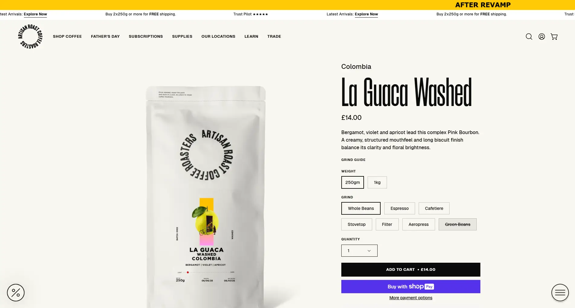
3. Richer Product Pages Tailored to Each Category
Single origins got deep-dive origin stories and tasting notes; signature blends showcased best use cases and pairing ideas. Different layouts for different coffees made every page feel crafted — not cookie-cutter.
4. Media-Rich Descriptions That Tell the Story
Beautiful imagery, flavour wheels, and farm photos brought each coffee to life. Clear brewing tips reduced buyer hesitation, making it easy for beginners and pros alike.
5. Upgraded Product Cards with Quick Add
On every listing page, shoppers now see tasting notes, origin highlights, and a handy Quick Add button — making it effortless to build a cart without jumping back and forth.
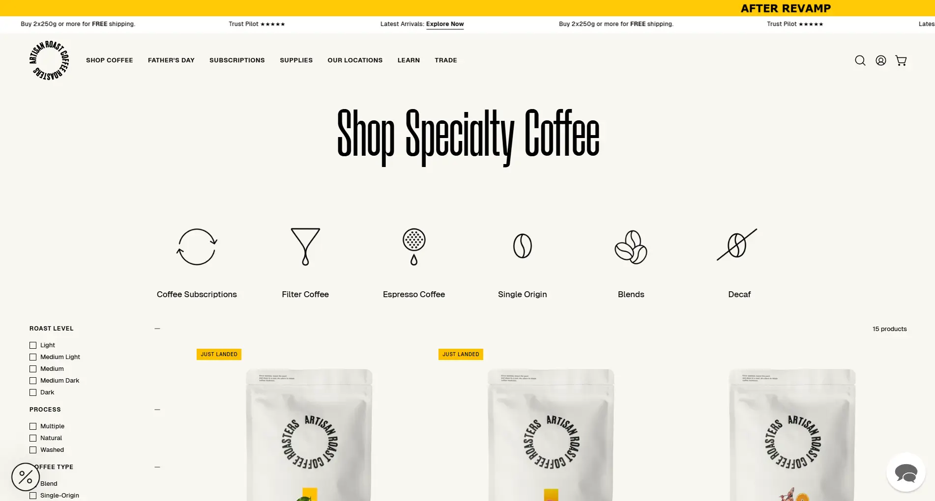
6. Revamped ‘Shop All Coffee’ Page
A more engaging overview lets curious customers browse everything at a glance — with smart filters and better sorting to guide them from browsing to buying.
7. Consistent Café Location Pages
We gave each café page the same love: clear opening hours, beautiful photos, and Google Maps embeds. Locals can easily plan a visit — and tourists find it welcoming too.
8. A Thoughtfully Refined User Experience
Every pixel, spacing, and element was tuned for a cleaner, more modern look that’s as inviting as Artisan Roast’s physical cafés.
The bottom line: From the first click to the final sip, every touchpoint now feels handcrafted — just like their coffee.
The Impact
In just a few months post-launch:
✅ 15.51% increase in mobile conversions
✅ 13.60% overall conversion lift
✅ 8.2% increment in first-time purchasers
Every tweak, from clearer navigation to richer product pages, added up to real, measurable growth — and a smoother experience that customers actually enjoy.
Why This Matters for Your Roastery
Great coffee is about more than just beans — it’s about people. The regular who stops in every morning. The home brewer who discovers your single origin online and tells their friends. The busy parent who loves knowing their favourite bag arrives like clockwork.
Your website should make all of that feel easy — and just as warm and welcoming as your café.
Your online store needs to do more than look good — it should convert visitors into subscribers, encourage repeat orders, educate people about your coffee, and quietly handle the heavy lifting while you focus on roasting.
Yet too many roasters still lose sales to cluttered menus, hidden subscriptions, and frustrating mobile experiences.
A smart, research-driven Shopify revamp turns your site into a 24/7 sales engine your customers love to use.
Grow deeper roots. Serve your community better. Brew more sales — one click at a time.
Want a Quick Audit for Your Coffee Brand?
Get a FREE Micro Audit — we’ll send you 3 actionable fixes or improvements you can make to your website right now.
Let’s make your site mobile-friendly, conversion-ready, and easy to navigate.